Joyfeel Naturals
Joyfeel Naturals makes handmade beauty and hair care products. They needed a visual identity that could communicate their natural product philosophy while creating a premium, memorable brand presence. We built a complete identity system for them: a logo symbol combining a leaf with a mortar and pestle, a soft natural colour palette, typography, and brand guidelines that keep every application consistent.
Project Details
Company
Joyfeel Naturals
Industry
Natural Beauty Care
Services Provided
Branding
Year/Timeline
2026/2months
A Premium Natural Identity
We created a complete visual identity for Joyfeel Naturals that brings together natural elements, premium aesthetics, and consistent brand communication.
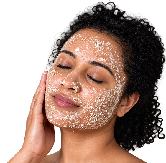
Joyfeel Naturals
Handmade Beauty & Hair Care
Joyfeel Naturals needed a visual identity that could communicate its natural product philosophy while creating a premium and memorable brand presence.
Branding
We developed a cohesive visual identity that brings consistency across the brand and creates a clear visual direction for future communication.
Challenge & Approach
The brand needed a more consistent visual identity that could communicate its natural positioning while maintaining a premium and modern appearance.
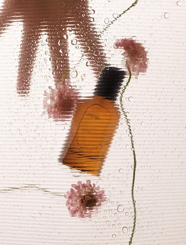
Inconsistent visual identity
The existing brand communication lacked a defined visual direction, making it difficult to maintain consistency across different brand applications.
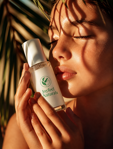
A clear and natural brand direction
We created a structured identity system focused on natural elements, refined typography, and a soft color palette to give the brand a consistent and recognizable presence.
A Complete and Cohesive Brand System
The Joyfeel Naturals identity was built around a simple, meaningful visual language that brings together the logo, color palette, typography, and essential brand guidelines. Every element was thoughtfully designed to create a consistent, recognizable, and premium brand experience.
A Meaningful Logo Symbol
The logo combines a leaf and mortar & pestle, symbolizing nature, handmade preparation, and beauty care within a balanced circular mark.



Consistent Communication
The visual elements work together seamlessly across all brand touchpoints for a unified identity.
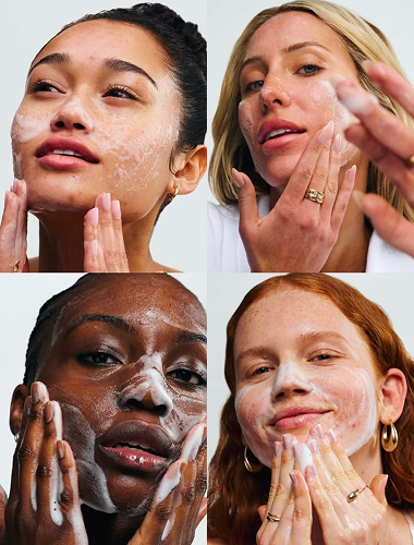
Elegant Typography
Playfair Display adds elegance and refinement, while Manrope brings a clean, modern, and readable balance.
A Soft and Natural Color Palette
Light green and off-white reflect freshness, natural ingredients, simplicity, and a premium feel.
Minimal & Premium
The final identity gives Joyfeel Naturals a natural, elegant, and consistent visual presence.
Visiting Card
We extended the new identity into a minimal and premium visiting card, keeping the design aligned with the overall brand language.
Logo Design
We designed a distinctive logo by combining a leaf and mortar & pestle, representing natural ingredients, handmade preparation, and beauty care within a simple circular form.
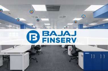
Bajaj Finserv
Environment branding for a financial services workspace, from wall panels and posters to room accents.
Explore
Rasrang Caterers
Indore-based catering service delivering flavorful food, reliable event execution, and memorable dining experiences for every occasion.
Explore
Divine Aura Studio
Photography studio providing pre-wedding, wedding, and event coverage services across India with artistic vision and technical precision.
Explore