8th Jun 2026
The Psychology Behind Great Graphic Design - What Makes Visuals Stick?
Ever wondered why certain logos instantly grab your attention while others fade into the background? The secret lies in understanding the psychological triggers that make graphic design truly effective.
IntroductionIn today's digital world, people are exposed to thousands of visual messages every day. From social media posts and website banners to advertisements and product packaging, graphic design plays a crucial role in shaping how information is perceived and remembered. However, not all designs leave a lasting impression. Some visuals are forgotten within seconds, while others remain in our minds for years. The difference often lies in the psychology behind graphic design.
Color Psychology in ActionColors aren't just pretty decorations - they're powerful emotional communicators. Red sparks urgency and passion, which is why sale tags and call-to-action buttons often use this vibrant hue. Blue builds trust and reliability, making it a favorite among tech companies and financial institutions. Green represents growth and harmony, perfect for eco-friendly brands and wellness businesses.
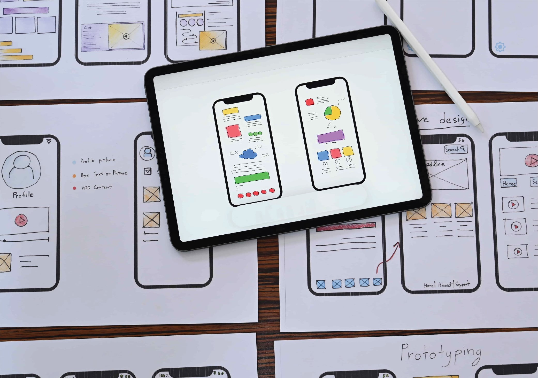
The Rule of Visual HierarchyYour brain processes visual information in a specific order, and smart designers use this to their advantage. Large, bold elements naturally draw attention first, followed by medium-sized components, then smaller details. This creates a visual roadmap that guides viewers through your message without overwhelming them.
Minimalism Meets Bold ImpactThe 2025 design landscape embraces "bold minimalism" - a trend that proves less can indeed be more. By stripping away unnecessary elements and focusing on strong typography, strategic white space, and purposeful color choices, designers create memorable experiences that resonate with audiences who are bombarded with visual noise daily.
Building Emotional ConnectionsGreat graphic design doesn't just look good - it feels right. When viewers can emotionally connect with your visual message, they're more likely to remember your brand, trust your expertise, and ultimately choose your products or services. This emotional resonance transforms casual observers into loyal customers.
Graphic Design as a Strategic Communication ToolIn today's competitive marketplace, graphic design is no longer just an artistic discipline, it is a strategic communication tool. Understanding how people think, feel, and process information allows designers to create visuals that not only look appealing but also influence behavior and strengthen brand recognition. The most successful designs are those that balance aesthetics with psychology, creating experiences that resonate with audiences long after they have seen them.
ConclusionGreat graphic design is built on more than creativity and technical skills. It is rooted in psychological principles that influence attention, perception, emotion, memory, and decision-making. By understanding how the human brain responds to visual stimuli, businesses and designers can create more effective marketing materials, stronger brand identities, and memorable user experiences. When design aligns with human psychology, visuals become more than just attractive, they become unforgettable.
Frequently Asked Questions (FAQs)1. Why is psychology important in graphic design? Psychology helps designers understand how people perceive, interpret, and respond to visual information. This knowledge allows them to create designs that capture attention, evoke emotions, and encourage desired actions.
2. How do colors affect graphic design?Colors influence emotions and perceptions. Different colors can communicate trust, urgency, excitement, calmness, or positivity, making color selection a key factor in effective visual communication.
3. Why are simple designs often more effective?Simple designs reduce cognitive overload, making information easier to process and remember. Clean layouts improve user experience and increase message clarity.
4. How does graphic design impact brand recognition?Consistent visual elements such as colors, logos, typography, and imagery make brands more recognizable and memorable, helping build trust and customer loyalty.
Follow us on
Other featured blogs
The Psychology Behind Great Graphic Design - What Makes Visuals Stick?

Digital Marketing for Small Businesses - Your Roadmap to Online Success

Building a Brand That Resonates - More Than Just a Pretty Logo

The Art of User Experience Design - Creating Websites People Love to Use