18th May 2026
Responsive Web Design - Ensuring Your Website Works Everywhere
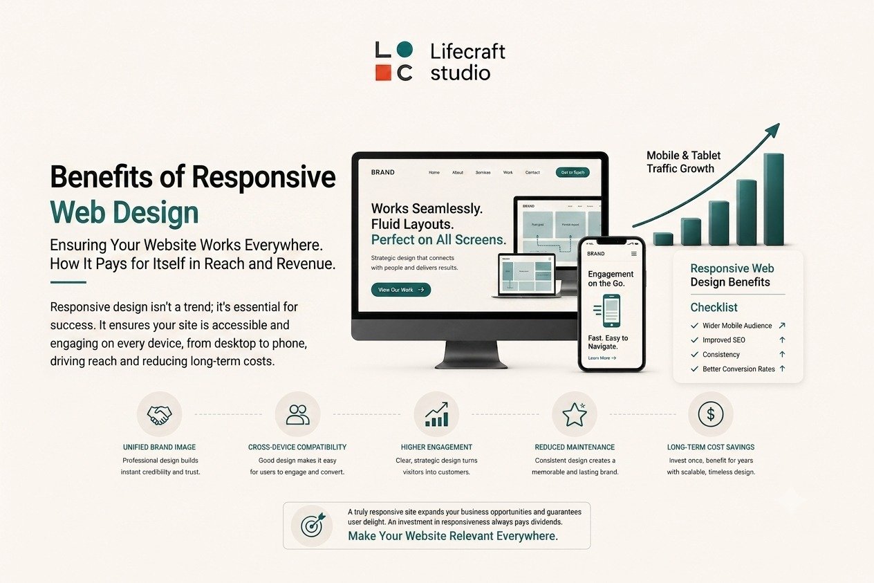
IntroductionIn today's multi-device world, responsive web design isn't a luxury feature - it's a fundamental requirement for business success. Your website needs to provide excellent experiences whether visitors are using smartphones, tablets, laptops, or desktop computers. As user behavior continues to evolve, businesses must ensure their websites are accessible, functional, and visually appealing across all screen sizes and devices.
A responsive website automatically adjusts its layout, images, navigation, and content to fit the user's screen, creating a seamless browsing experience. This flexibility not only improves user satisfaction but also supports SEO, conversion rates, and overall business growth.
The Mobile-First RealityMobile devices now account for over 58% of global website traffic, making mobile optimization essential rather than optional. Google's mobile-first indexing means your mobile site's performance directly impacts your search rankings, affecting how easily potential customers can find you online.
User Experience Across All DevicesResponsive design ensures consistent functionality and visual appeal regardless of screen size. Visitors shouldn't have to pinch, zoom, or scroll horizontally to access your content. When your website adapts seamlessly to different devices, users stay engaged longer and are more likely to complete desired actions.
Flexible Layouts and Adaptive ContentOne of the core principles of responsive design is flexibility. Modern responsive websites use fluid grids, flexible images, and adaptive content structures that automatically adjust based on screen dimensions.
This flexibility ensures that text remains readable, images display correctly, and navigation menus remain accessible regardless of device size. Adaptive content delivery also helps prioritize important information for users on smaller screens.
Faster Loading Speeds for Better PerformanceWebsite speed is a critical factor in user experience and search engine rankings. Responsive websites are designed to optimize content delivery, helping pages load quickly across devices.
Techniques such as image optimization, lazy loading, compressed files, and efficient coding practices contribute to faster loading times. Improved performance reduces bounce rates and increases the likelihood of user engagement and conversions.
SEO Benefits of Responsive DesignSearch engines prefer responsive websites because they provide better user experiences. A single responsive site is easier for search engines to crawl and index compared to separate mobile and desktop versions. This improved search engine optimization leads to higher rankings and increased organic traffic.
Simplified Maintenance and Cost EfficiencyManaging one responsive website costs significantly less than maintaining separate versions for different devices. Content updates, security patches, and feature improvements only need to be implemented once. This efficiency saves time, reduces complexity, and allows you to focus resources on growing your business rather than managing multiple websites.
Future-Proofing Your WebsiteTechnology and device types continue to evolve. Responsive design helps future-proof your website by ensuring it can adapt to new screen sizes and emerging technologies without requiring major redesigns.
Businesses that invest in responsive design today are better prepared to meet future user expectations and technological advancements.
ConclusionResponsive web design is no longer optional; it's essential for providing exceptional user experiences, improving search visibility, increasing conversions, and supporting business growth. As users continue to access websites through a variety of devices, businesses must ensure their online presence remains flexible, accessible, and easy to use.
By embracing responsive design principles, organizations can create websites that perform effectively across all devices while delivering consistent experiences that build trust, engagement, and customer loyalty.
Frequently Asked Questions (FAQs)1. What is responsive web design?Responsive web design is an approach that allows websites to automatically adapt their layout and content to different screen sizes and devices.
2. Why is responsive web design important?Responsive design improves user experience, supports SEO, increases accessibility, and ensures websites function properly across all devices.
3. What is the difference between responsive and mobile-friendly design?Responsive design automatically adapts to different screen sizes, while mobile-friendly websites are simply usable on mobile devices but may not fully adjust layouts dynamically.
Follow us on


Other featured blogs

The Psychology Behind Great Graphic Design - What Makes Visuals Stick?

Digital Marketing for Small Businesses - Your Roadmap to Online Success

Building a Brand That Resonates - More Than Just a Pretty Logo

The Art of User Experience Design - Creating Websites People Love to Use